
Website Redesign I Internal Tool I Technology
Sunset a website in 4 weeks, meeting the needs of diverse audiences
Revisiting fundamental design principles while incorporating user and stakeholder feedback to create a more engaging experience for Apple engineers

BACKGROUND: Apple Cloud Services is an internal tool designed for Apple software engineers to explore products and services, and access detailed technical documentation relevant to their projects.

2022
DURATION: 4 Weeks
PLATFORM: SaaS Responsive Web App
ROLE: Lead Product Designer, Big Nerd Ranch
SKILLS & METHODOLOGIES:
Stakeholder Interviews, Reviewed Previous Designs, Qualitative & Quantitative Analysis, User Interface Design
TOOLS & FRAMEWORKS:
Figma, Human Interface Guidelines
PROBLEM:
Apple software engineers weren’t engaging with the site as a resource, and Nexus, an Apple partner, was dissatisfied with the website. This hesitation led to reluctance in sunsetting the current site and migrating there data to Apple Cloud Services.
SOLUTION:
We identified opportunities to improve content and visual hierarchy to better serve both types of users. Additionally, we focused on introducing consistency and cohesion between this website and other Apple websites.
Why it’s important: Engineers need to quickly find information to troubleshoot their projects. They also require clear, easily digestible content to understand the products and services available, enabling them to make informed decisions for their projects.
OUTCOME:
Successfully sunsetting the Nexus website in only 4 weeks
Meeting the needs of multiple audiences
Full case study ~2 min read
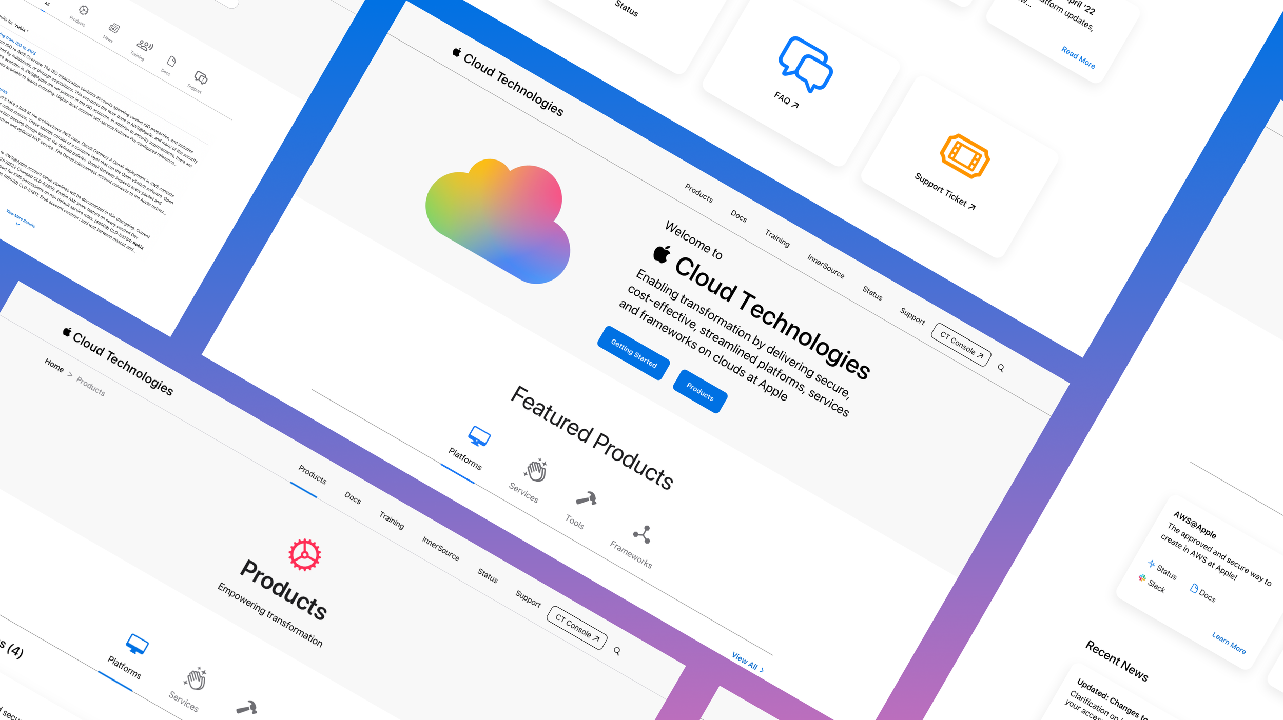
Setting the Stage
Apple Cloud Services is an internal platform for Apple engineers to explore products and access technical documentation. However, low engagement and dissatisfaction from a key partner, Nexus, signaled deeper usability issues. With just four weeks to sunset the legacy Nexus site and migrate data, our team at Big Nerd Ranch was brought in to redesign the experience. Our focus: apply core design principles, address user and stakeholder feedback, and create a more consistent, intuitive experience aligned with Apple’s broader ecosystem.
Problem
Apple software engineers weren’t engaging with the site as a resource, and Nexus, an Apple partner, was dissatisfied with the website. This hesitation led to reluctance in sunsetting the current site and migrating there data to Apple Cloud Services.
Solution
We identified opportunities to improve content and visual hierarchy to better serve both types of users. Additionally, we focused on introducing consistency and cohesion between this website and other Apple websites.
GOALS:
What We Did
Establish continuity across all Apple sites
Sunset the Nexus site and migrate all data to Apple Cloud Services
Increase site engagement
Address specific user and stakeholder feedback
Create a dark mode version


Challenge
Our biggest challenge was the tight 4-week timeframe to onboard, understand the product and its users, and complete the project. In addition to addressing specific feedback from users and stakeholders, we revisited fundamental design principles to ensure success.
VISUALS:
Back to Basics
Best practices for proximity, spacing, size, and scale
Introduced SF Symbols to enhance consistency and convey content effectively
Content and visual hierarchy, along with color and contrast
Familiar patterns and components
Created a dark mode
Integrated system-defined components
RESULTS:
Shaping Bold Outcomes
Successfully sunsetting the Nexus website in only 4 weeks
Meeting the needs of multiple audiences