


SaaS Web App I B2B I Real Estate
Saving clients 10+ hours per week, per closing
Modernizing back and front-end experiences to meet the needs of a new generation of real estate professionals
BACKGROUND: SnapClose in a small organization, yet an old company. They specialize in real estate closing SaaS software that allows real estate professionals to generate closing documents with ease while reducing closing times.

2019 - 2020
DURATION: 6 Months
PLATFORM: SaaS B2B Web App
ROLE: Principal Product Designer, Studio b Creative Co.
SKILLS & METHODOLOGIES:
Product Demo, Competitor Demos, Competitive Analysis, User & Stakeholder Interviews, Workshops, Qualitative and Quantitative Audit, Requirement Gathering, User Interface Design, Roadmap Creation and Prioritization, Surveys and Questionnaires, A/B Testing, Prototyping, Information Architecture, UX Principles, Design Systems
TOOLS & FRAMEWORKS:
Sketch, Miro, PowerBI, ADA, Information Architecture, Design Systems, Material Design
PROBLEM:
The software was outdated, driving customers to competitors
The rigid back-end limited flexibility
The UX/UI needed a complete redesign for modern usability to attract a younger, tech-savvy generation
SOLUTION:
Upgraded the platform to React and built a reusable design system
Conducted competitor analysis, user interviews, and usability testing
Introduced key improvements like paperless closings, enhanced search, and multi-user collaboration
Created a streamlined design process for future scalability
OUTCOME:
The beta version was completed on time
Clients saved an average of 10+ hours per week, per closing
The new UX/UI improved efficiency and positioned SnapClose as a modern industry leader
Full case study ~5 min read
Setting the Stage
As technology rapidly evolves, staying competitive requires more than just a functional product — it demands innovation and adaptability. When the founder’s daughter took over SnapClose, she recognized that the outdated software and rigid back-end were pushing customers toward more modern alternatives. To secure the company’s future and attract a younger, tech-savvy audience, a complete transformation was necessary.
Problem
The software was outdated, driving customers to competitors
The rigid back-end limited flexibility
The UX/UI needed a complete redesign for modern usability to attract a younger, tech-savvy generation
Solution
Upgraded the platform to React and built a reusable design system
Conducted competitor analysis, user interviews, and usability testing
Introduced key improvements like paperless closings, enhanced search, and multi-user collaboration
Created a streamlined design process for future scalability
Goals
Expand Integrations: Seamlessly integrate with Outlook and QuickBooks to enhance workflow efficiency and data synchronization
Enable Paperless Closings: Streamline the closing process by eliminating the need for physical documents, improving speed and sustainability
Enhance Search Functionality: Introduce more granular search criteria to help users quickly and accurately find the information they need
Support Multi-User Collaboration: Allow multiple users to work within a single order, improving teamwork and operational efficiency
DISCOVERY:
What We Did
To kick off product discovery, I met with stakeholders to align on business goals, product vision, and existing processes, uncovering a lack of historical data collection. I scheduled product demos, collaborated with Customer Service Reps to identify common challenges, and used Miro boards to map workflows, pinpoint pain points, and uncover opportunities. Conducting a competitor analysis of platforms like Quail, SoftPro, and ResWare, I worked with the Product Owner and Lead Developer to refine requirements, ensuring alignment with business objectives and user needs.
What We Learned Users Want…
• Integrations with Outlook and Quickbooks
• Paperless Closings
• Granularity in Search Criteria
• Support Multiple Users in a Single Order

…She was able to quickly grasp layers upon layers of complexity and understand the use cases for our very tedious project. The ability to look at a set of requirements from multiple angles and come up with an entirely new approach was absolutely astounding to us…
Johnathan Garcia
Sales & Product Director, SnapClose

INITIAL CONCEPTS:
What We Tested

Concept A

Concept B
What We Learned…
Both concepts were intuitive enough for users to jump in without training
Users preferred seeing analytics higher up on the page
The first design felt too busy, while the second was clearer and bolder
DELIVERABLES:
What’s Next?

Weekly Syncs and Reviews
Design Principals
Sitemap
High-fidelity Wireframes
Prototypes
Usability Tests
First Impression Survey, System Usability Scale (SUS), Questionnaire UI Satisfaction (QUIS)
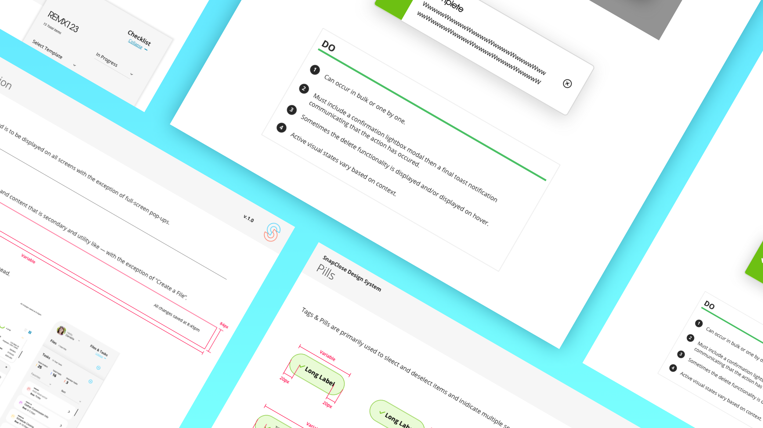
Design System
And, Continuous Testing and Iterations!
VISUALS:
Final Form
Vendor Marketplace
Streamlining real estate transactions through trusted partnerships to improve turn-around times
Persona Based Dashboard
2 distinct views based on your role; Manager vs Broker
Closing Templates
Use closing templates with documents at each stage to save time
Checklists
Create template-based checklists to ensure tasks are completed

Tasks
Brokers can easily complete tasks via the Dashboard
RESEARCH GENERATED:
Guiding Principals
-
It’s simple — until we make it complicated. Avoid overcomplicating the experience, both internally and externally. Enhance the user’s ability to complete key tasks by removing obstacles, reducing clutter, and improving visibility. Simplicity is at the heart of everything we create.
-
Rigidity stifles progress—flexibility begins within and extends outward. It means building truly user-centered processes that help us create better products and adapt to a constantly evolving market, all while balancing user needs with business goals.
-
Design progressive, intelligent experiences that go beyond the competition. Create solutions that are welcoming, fast, easy to use, and genuinely useful — always reflecting and accommodating the real needs of our users.
-
Achieve quality through modularity and reusability — don’t reinvent the wheel. Use design system elements in flexible ways to create intuitive, personalized experiences. A strong, evolving design system ensures our projects grow naturally and stay consistent.
-
Accountability starts with us—and with our users. It’s a continuous process of listening, learning, and iterating. The better we understand our users, the better we can build accountability into our products, reduce risk, and create more effective, balanced solutions that meet both user and business goals.
-
Enable seamless third-party integrations that enhance — rather than complicate — the user experience.
SnapClose is extremely user friendly; its existing format allows seamless information access for each closing transaction. Its ability to enter, transpose, and email information to our clients and customers assures a streamline of efficiency.
Bea Demirakos
President & CEO, OnPoint Land Service Corporation

RESULTS:
Shaping Bold Outcomes
The beta version was completed on time
Clients saved an average of 10+ hours per week, per closing
The new UX/UI improved efficiency and positioned SnapClose as a modern industry leader